PEP 160 Module Reflective Log

So for this PEP 160 module I decided to pursue four different stories, the Holifield Farm Project, exploring the subcultures in the Stratford Centre, the early morning Smithfield Meat Market and documenting The Orwells’ live show.

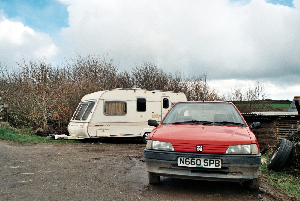
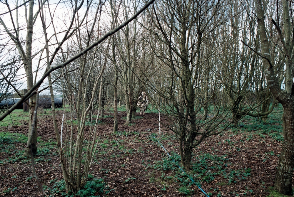
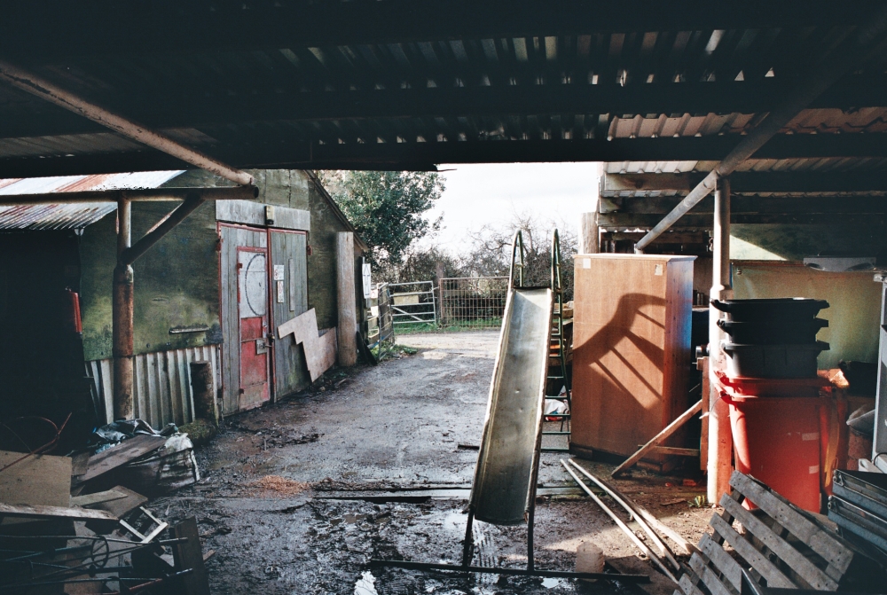
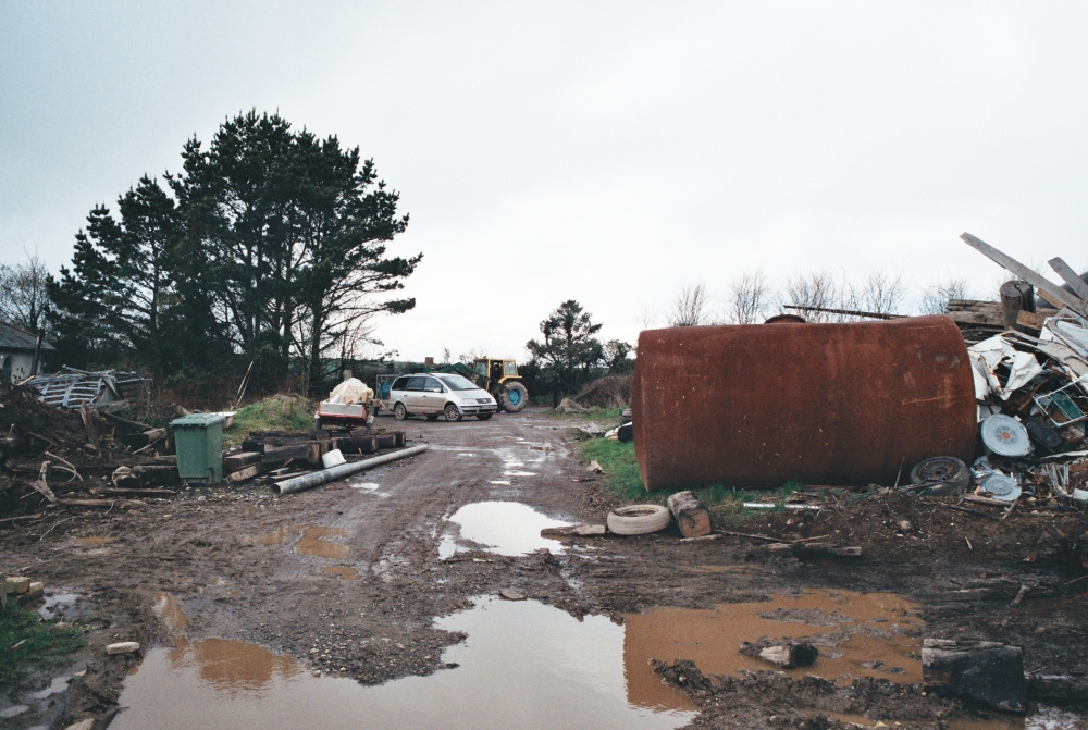
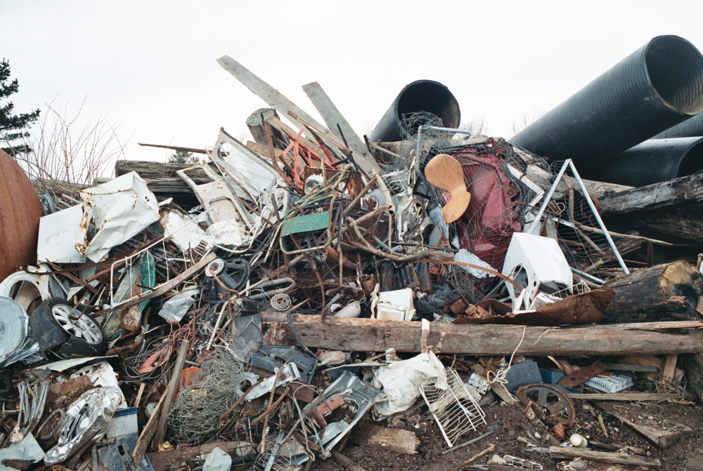
To start off with I’ll dive right in to how I found these stories and how things went from there. So for the Holifield Farm Project, I knew I was interested in doing a story about a community that’s involved with sustainable energy and cares about the environment. From then on it was fairly straight forward, I did a quick browser search of any communities involved in any of that in Cornwall, and up came the Holifield Farm Project. I gave them a call and quickly arranged for a time that I could take a trip to the farm and start on in with this story. I made a total of three visits to the farm, the first was the most disorganised seeing as the man that runs the place wasn’t aware that I was going to be there, so I went on a stroll and photographed what I could and it wound up being the most successful trip to the farm. The next two visits I was able to see what it is that Rob does on the farm and I was able to document Rob and Westley working on the hostel. However, when I got around to developing the rolls of film from the second shoot I’d greatly overexposed a lot of the photographs and had a lot of out of focus shots. When I went back the third time it was to see what it’s like for people living on the farm, so I spent some time with Westley in his caravan trying to photograph him in his space. I ran into some more problems here and still struggled to keep the images in focus and properly exposed, which was frustrating. I’ve continuously run into the same problem over several shoots and this would have to be a big takeaway from this module. In terms of trying to document stories through photography, especially when shooting analog, it’s really important to take time to think about the correct exposures and sort out focusing.

In terms of the double page spreads, I modelled them after the Patagonia Environmental and Social Initiatives Magazine which I found on Issuu. (see below)

Screen Shot 2017-05-01 at 14.35.35Screen Shot 2017-05-01 at 14.35.43

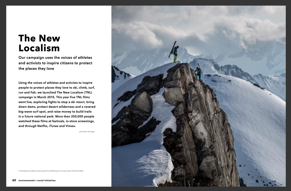
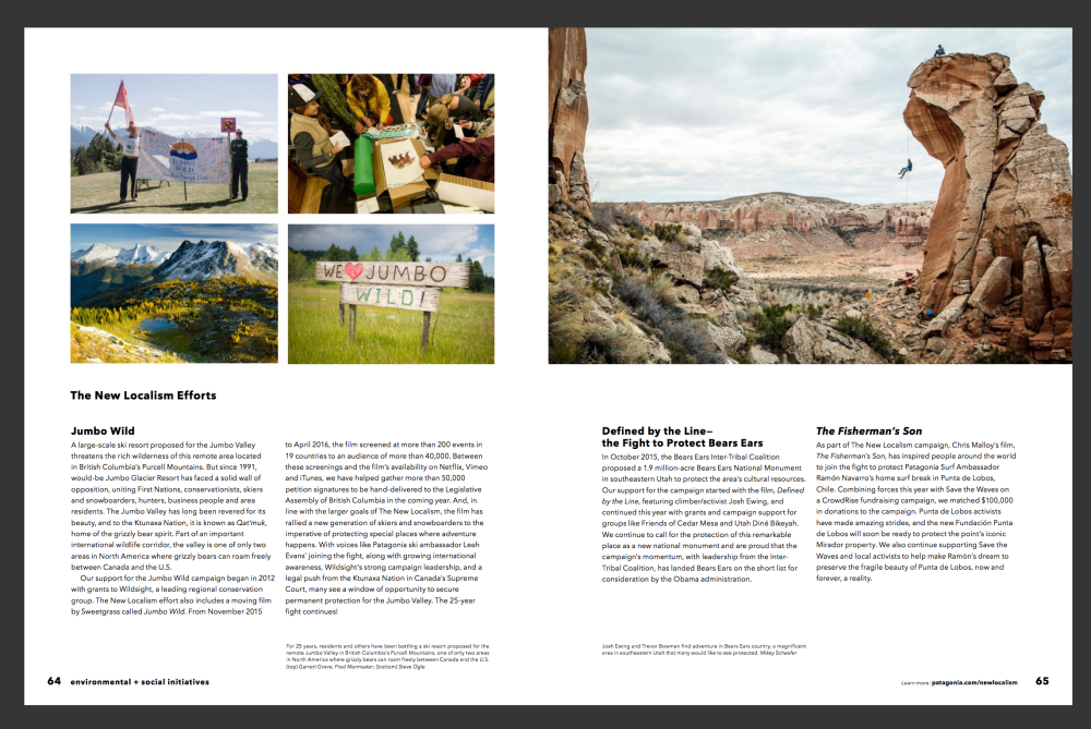
I chose this particular magazine because it had the photograph to writing ratio that I was looking for as well as a minimalist style. Seeing as it was my first time using InDesign I searched for minimalist designs for all the spreads because I really struggled using InDesign and don’t know how to add any shapes or special features. I also just like how minimalist magazines look aesthetically so it’s a bit of a win win.

So here’s a look at the spreads I did for the Holifield Farm Project:

Screen Shot 2017-05-01 at 14.59.01Screen Shot 2017-05-01 at 14.59.11

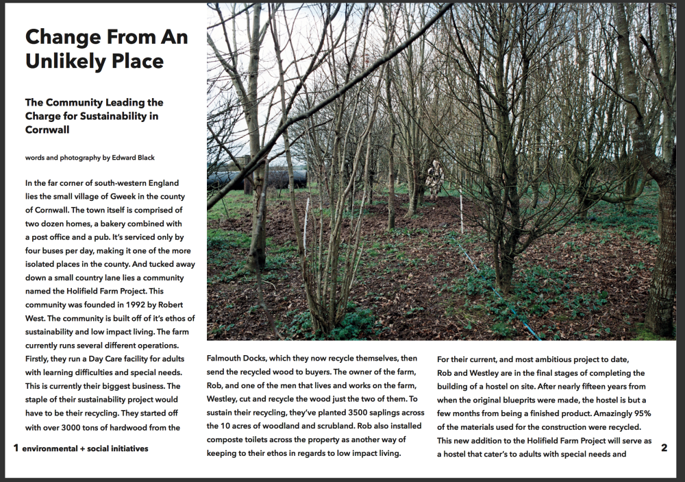
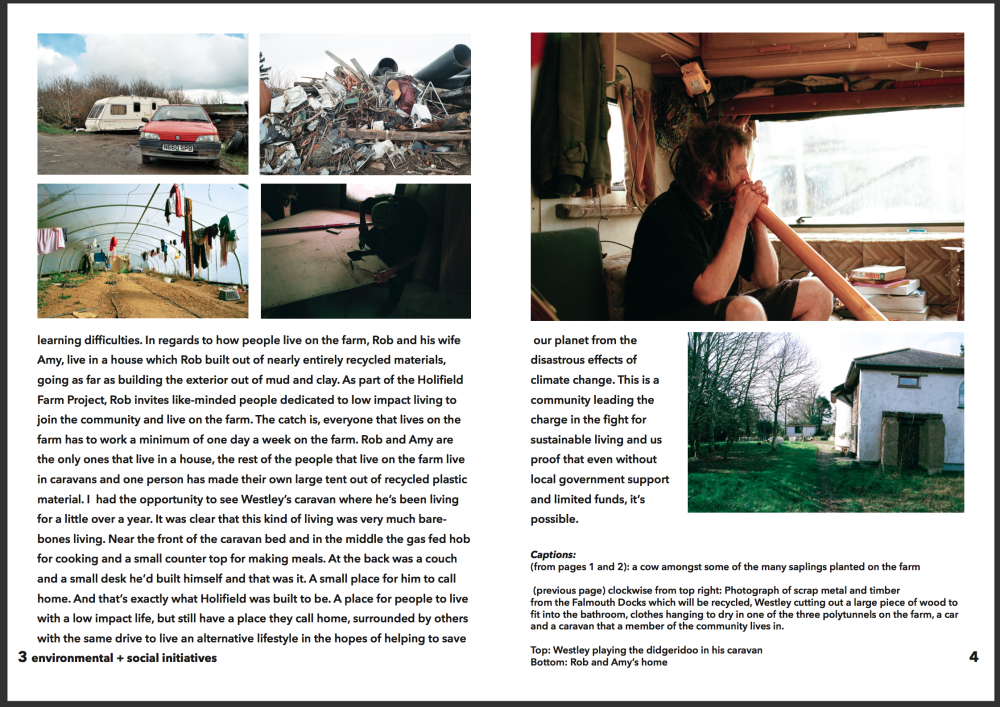
So for this spread I went to http://www.myfonts.com and was able to find this particular font on InDesign, which was the Avenir Next font. I tried to make the layouts similar by using similar spacing between words and the pictures. This spread also used photographs from my SDA.

One thing I definitely noticed whilst doing this spread is that I’ve really struggled with my writing. I’ve never really done journalistic writing before so it was challenging for me to have a fluent and engaging style of writing. I would definitely say that my writing is something that needs a lot of improvement and is something that I intend to work on over the coming months.

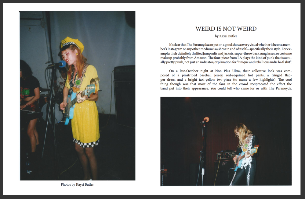
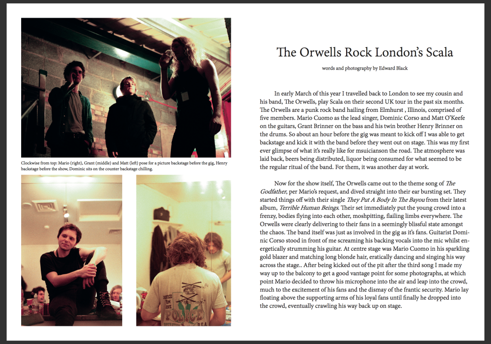
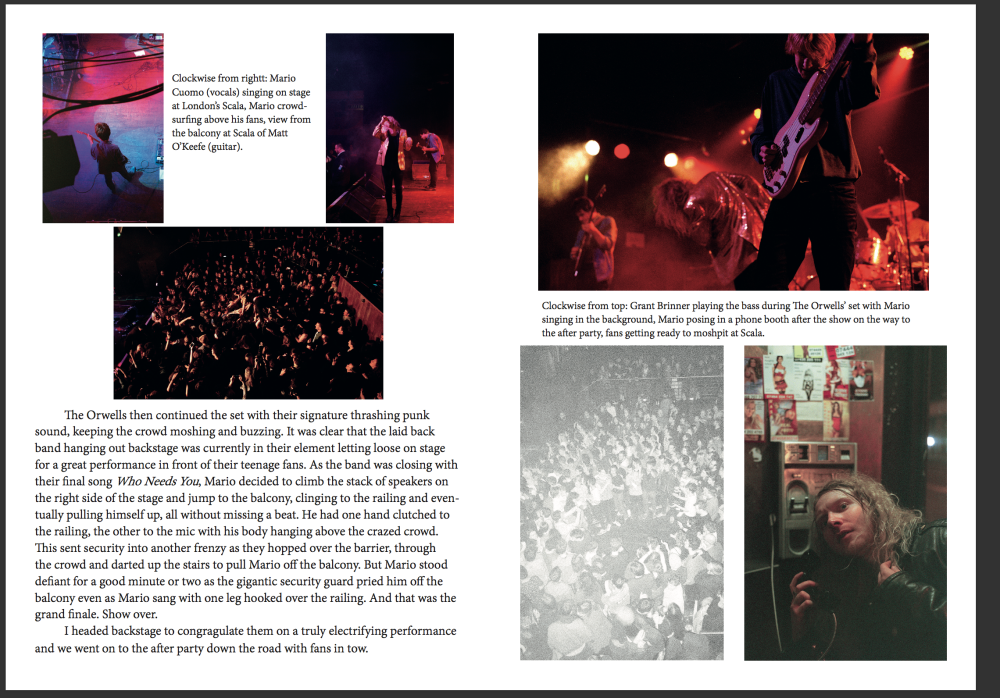
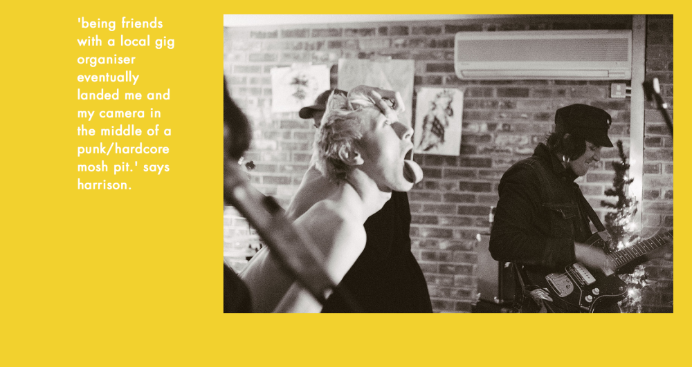
Now, moving on, the second spread I’d like to write about would have to be the spread I did on The Orwells.

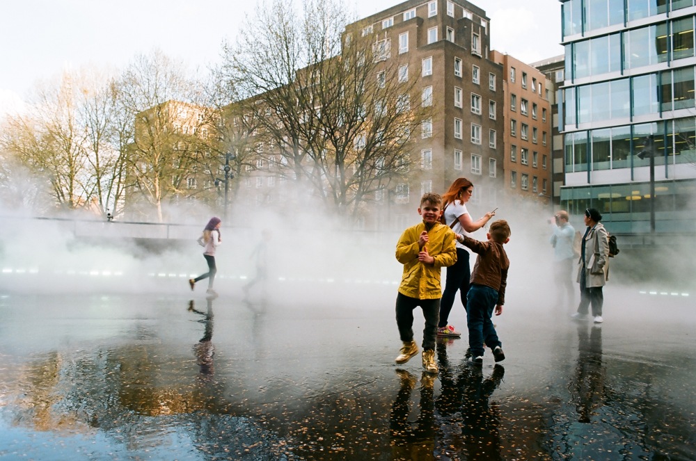
In March I went back to London and did a shoot of my cousin’s band playing at Scala. It was my first time ever shooting a gig so it was a totally new experience, which I really enjoyed. Fortunately I was able to nail my focusing down better and took more time with my shots. I noticed that shooting analog I miss what would be good shots whilst reloading film or trying to focus shots, which is one of those things that I’ve learned to just accept and not worry too much over what photographs I missed and instead focus on the ones I’ve got.

For the double page spreads I again looked to Issuu and found a California based music and fashion magazine called Quality Time. They have a minimalist design which I did my best to model mine after.

Quality Time Spreads:

Screen Shot 2017-05-01 at 14.36.15Screen Shot 2017-05-01 at 14.36.25

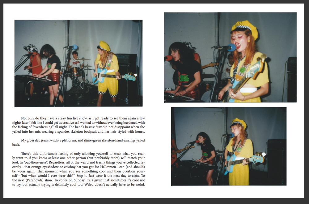
I tried to use similar spacing between images and was able to find the font from http://www.myfonts.com and used the Adobe Devangari font.

My spreads:

Screen Shot 2017-05-01 at 15.01.55Screen Shot 2017-05-01 at 15.02.02

I thought I was reasonably successful in modelling my spreads after Quality Time, the main difference being I added captions for the images, where Quality Time does not. I would say that the captions do clog up the design a bit but seeing as it was part of the module to add captions to the spreads I didn’t have much choice.

Again, I noticed that I struggled to do a good job of writing for this piece, something that is a recurring theme in all of my spreads is my difficulty with writing in a way that fits the spreads.

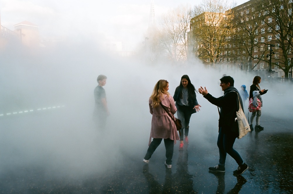
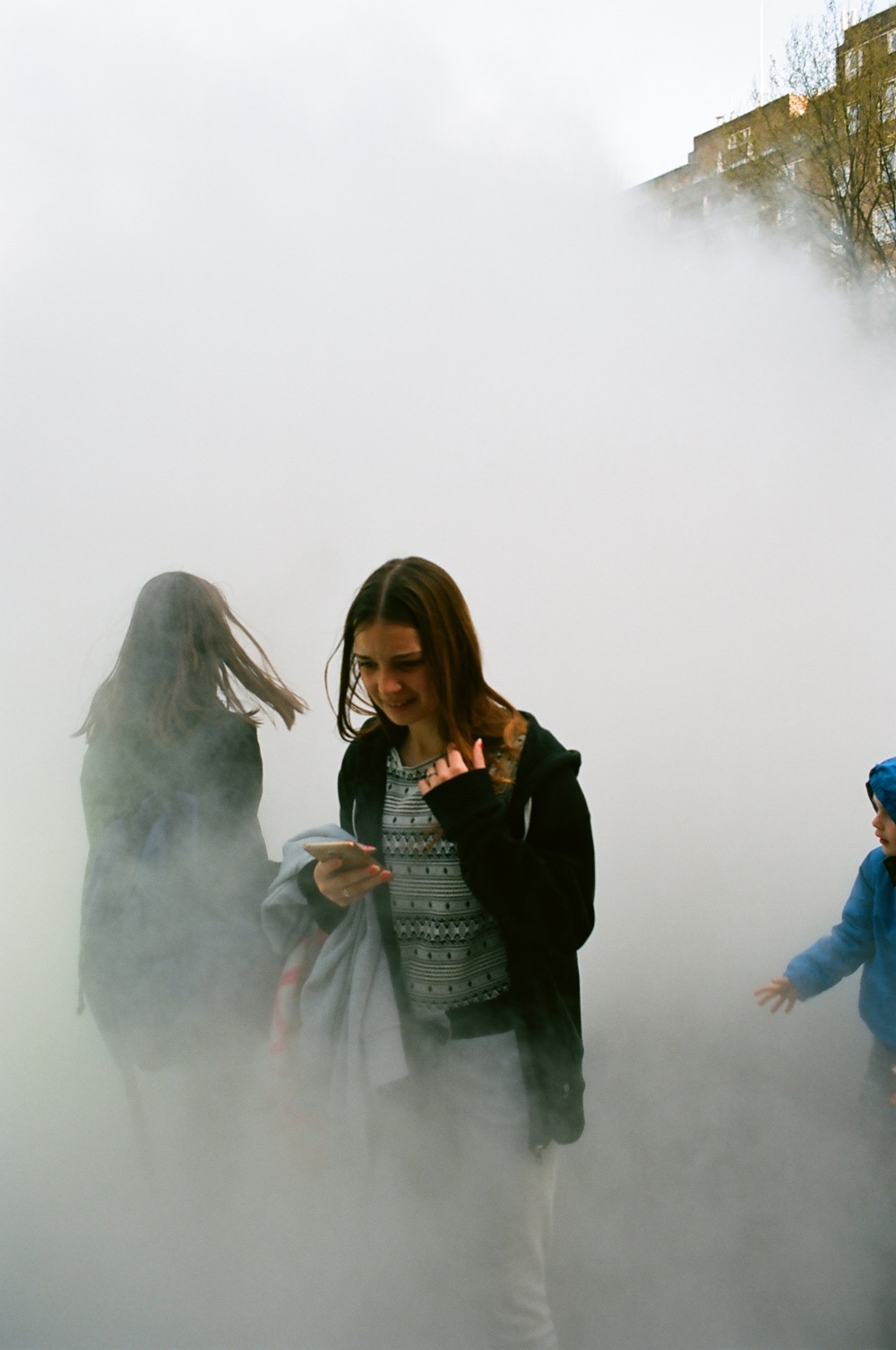
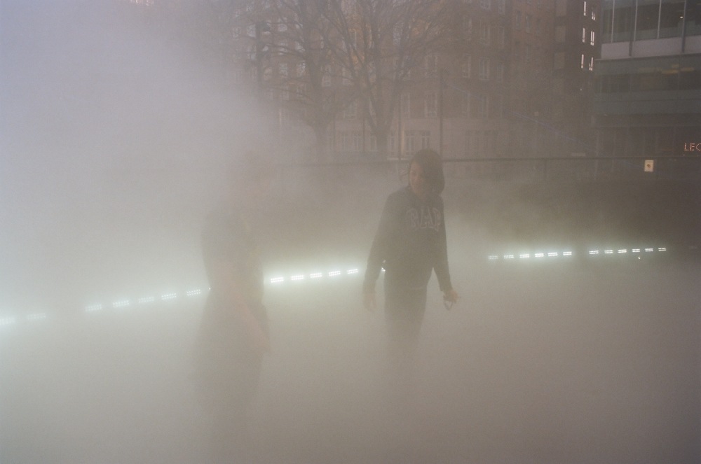
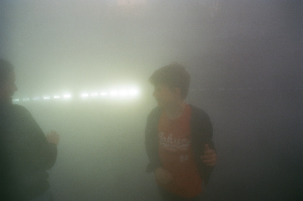
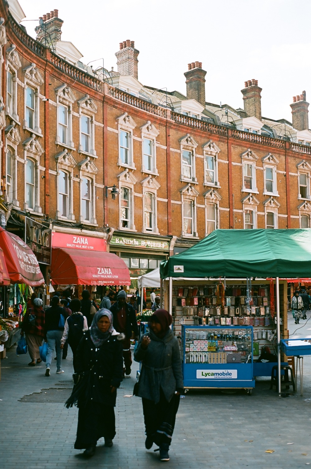
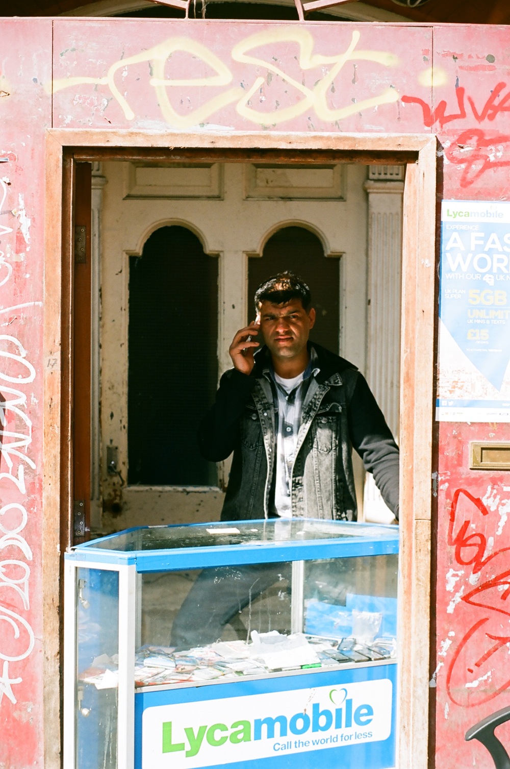
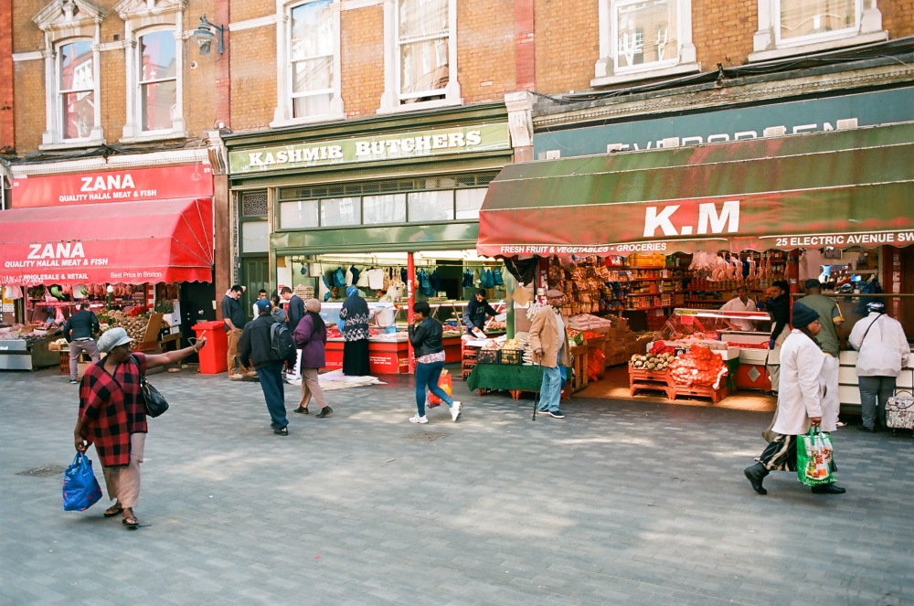
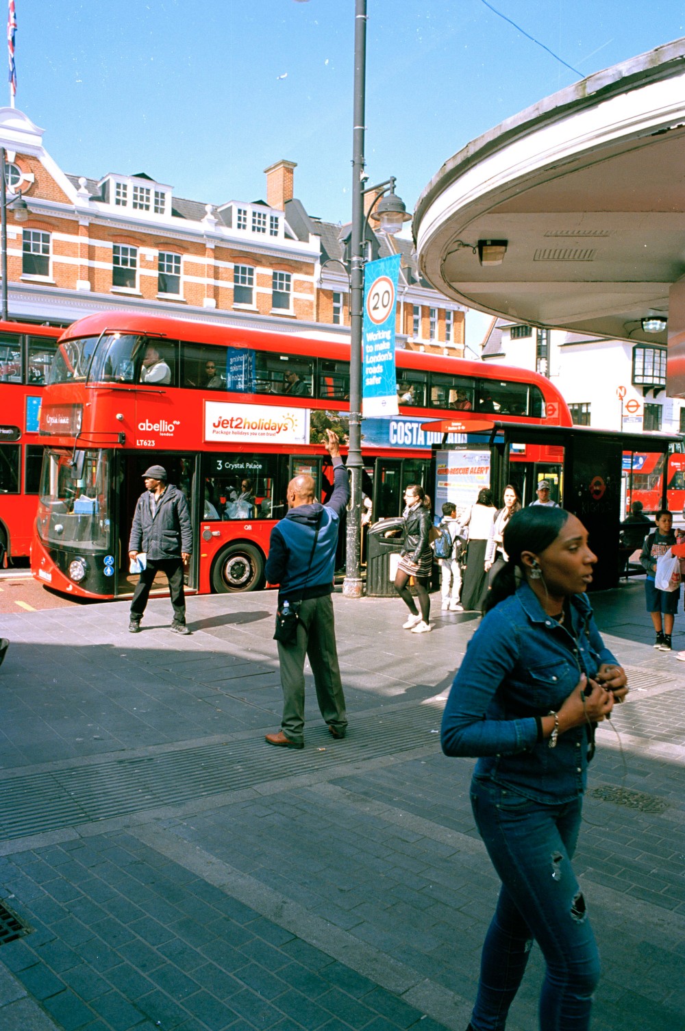
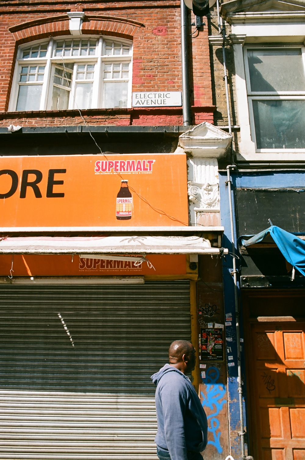
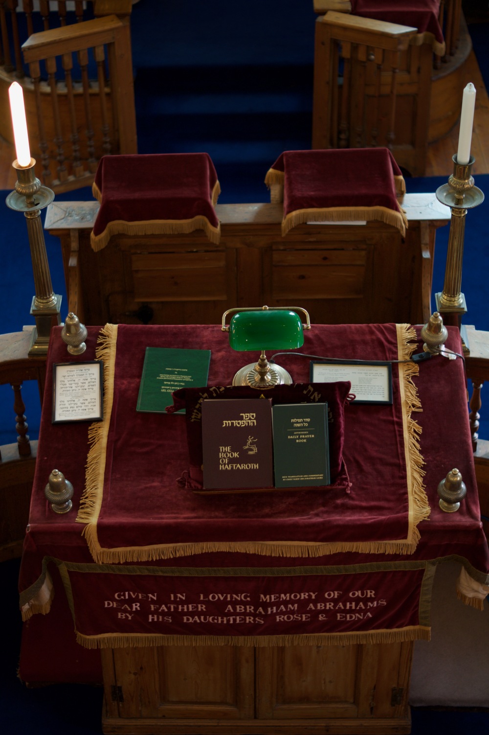
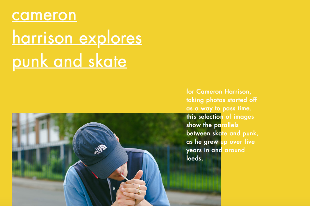
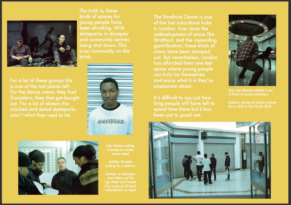
On to the third spread, which was a story I did on the skateboarders, roller skaters and dance crews that all spend time in Stratford’s Stratford Centre, which is now dwarfed by the semi-new Westfield across the road. I went and did three separate shoots at this mall, the first and third being the two most successful. The second shoot I came on a Saturday night and no one was there, the only people around were homeless people. It was a great opportunity to document a space under threat, because in London those kind of spaces are really rare. There’s very few indoor spaces left where teenagers can be themselves and part take in the subcultures they’re involved in. Especially considering these are people involved in subcultures that are on the fringes of mainstream society.

For this spread I decided to model it after Bloc Magazine:

Screen Shot 2017-05-01 at 14.36.46Screen Shot 2017-05-01 at 14.37.02

It’s a music, arts and fashion magazine run by Falmouth University students and at the moment it’s an online publication but as of right now they’re creating a zine and the main reason I decided to model my spreads after Bloc Magazine is because they’ve taken an interest in my work and may publish it in their first issue. This is also the magazine I used to pitch my work to, I responded to a post from them asking for submissions so I submitted some of these photographs and they responded to me on Instagram saying they’re interested in my work and would like to see more of it. Another big reason why I chose to use this as the publication I pitched to is because I’m more likely to get published by them than any other magazine and seeing as they’re close by there’s the possibility for a strong collaboration between me and the editors, so I saw this as a good opportunity to get published for the first time.

My spreads:

Screen Shot 2017-05-01 at 15.00.16Screen Shot 2017-05-01 at 15.00.01


Now, in terms of my spreads, I again used http://www.myfonts.com to find the font which was Futura Medium. and did my best to model my spreads after their online publication to anticipate what it is they might be looking for in the future for their zine.

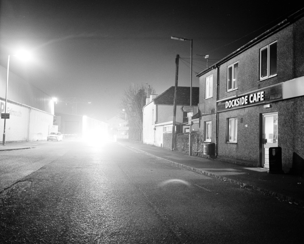
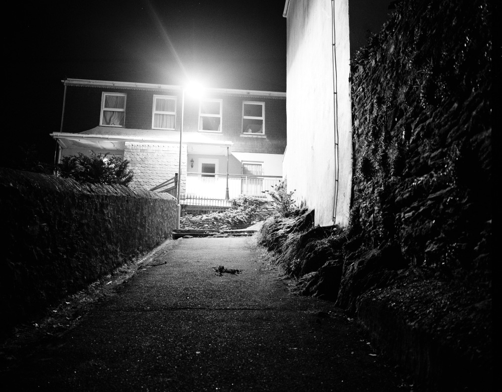
And finally the last spread. I got up early one morning and went to the Smithfield Meat Market for the first time and got to see what the early morning market is like. It was a pretty great experience, it’s really unique to be surrounded by this bustling market at that hour when everything else apart from the nearby cafes are shut and the streets are quiet with the soft morning light.

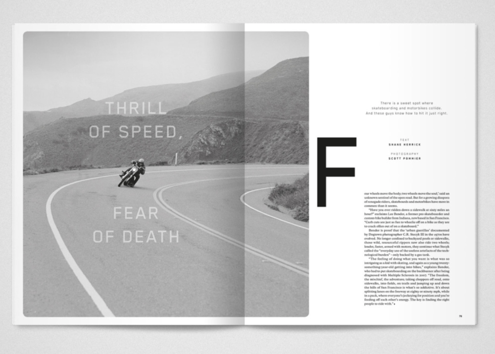
I modelled my spread after Huck Magazine, which was the only magazine I really thought this content would be able to live in considering it’s quite a photojournalistic story. So here’s the Huck spreads I tried to model mine after:

Screen Shot 2017-05-01 at 15.43.22Screen Shot 2017-05-01 at 15.43.42

Now to compare it to my spreads:

Screen Shot 2017-05-01 at 14.59.30Screen Shot 2017-05-01 at 14.59.45

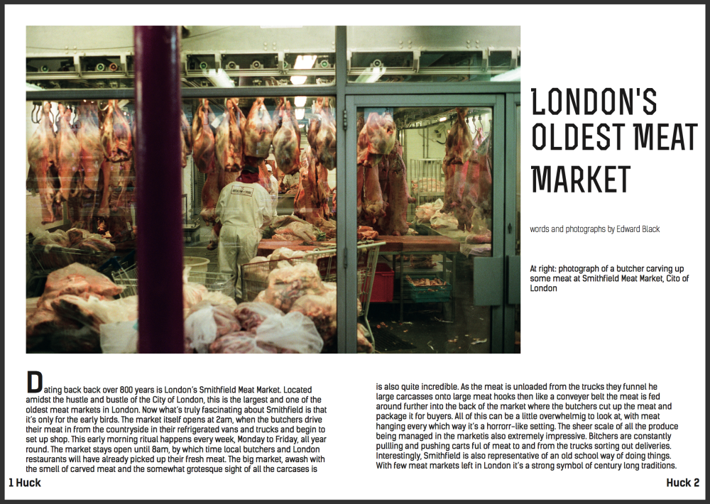
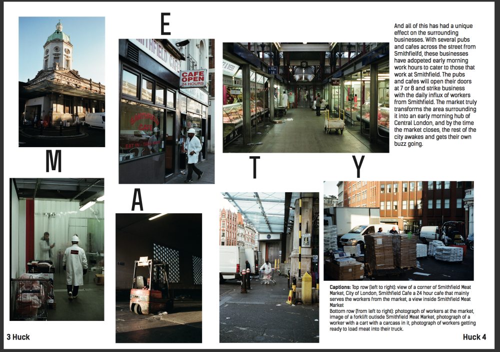
I think I did an alright job with trying to model mine after Huck, I wasn’t able to find any similar font so I decided to download the Rex and Kensal fonts online because I think they fit the best. Again I really struggled with my writing but it’s something I know I have to work on. This spread was one of the more difficult ones because it was only one shoot it was hard for me to get into the storytelling aspect with the writing, however I do think the photographs do a good job of telling the story of Smithfield Meat Market.

To conclude, this module was the most useful module yet considering it involves a lot of what I hope to be doing after I leave university seeing as it’s one of my goals to be able to work for or get work published in any of these kinds of magazines. It was also difficult to get the hang of InDesign and the writing style of this kind of work but from a photographic standpoint I really enjoyed this work, especially given that I shot everything on 35mm film, which was really fun for me because it’s my preferred format compared to digital photography.

PEP 140 Coming to a close

For my last post I just wanted to reflect a little on this past semester in regards to this module.

Over the past few months I think I’ve been able to develop a lot as a photographer and really hone in my skills shooting on film seeing as everything for this module, except for the Plymouth Shoot, was shot on film. It’s made me feel much more confident with the camera and more confident in myself and my abilities as a photographer. Also, this module has greatly helped me be a better documentary photographer. Seeing as all of these shoots were based on storytelling one way or another I feel like I’m slowly getting a handle on how to do it. Looking at photographers like Alex Webb and Jay Maisel has helped me look for more interesting shots when shooting in the street. Looking at O. Winston Link’s work has also helped me work better with lighting at night especially when I was doing my 5 picture story.

All in all I really enjoyed doing this module and look forward to building off of this in the coming months.

Relationships Shoot

So for my relationships shoot I decided to go to Fujiko Nakaya’a exhibition at the Tate Modern in London and photograph people interacting with her vapour sculpture. The great thing about this was that people were interacting with themselves in a really playful way in the mist and it also helped bring an interesting dynamic into the pictures as people were running in and out of the mist. It was a great opportunity to photograph these very candid interactions between people and the way the mist affected the relationship.

So here’s the final cut:

0696001006960012069600130696001406960016

London Shoot

For the London shoot I wound up going to Brixton and documenting Electric Avenue, which is a market street in Brixton that curls from Brixton Road to Atlantic Road. It’s an iconic part of Brixton that I’ve always loved walking through. It’s vibrant and full of life and totally epitomises London as a city. Although the road isn’t particularly long it has this great soft curve to it which is what really makes it unique.

In terms of the photographs, they turned out pretty good, I was quite pleased with things and I thought I did a good job of representing Electric Avenue itself but also within the 5 pictures I tried to show that it represents London in a lot of ways, that there are markets and people just like that of Brixton all over London.

Here’s the final cut:

069500080695001006950023Scan00106950026

5 Picture Story

So I finally did my 5 picture story on Falmouth by night. I shot this on a Mamiya 7 ii which was my first time using medium format. I shot it on a roll of Ilford HP5 and decided to restrict myself to the one roll. I shot it all on a tripod and carefully lined up the focus and composition of each shot. It was really important for me to limit myself to this one roll because I wanted to prove to myself that I could be careful enough and decide in the moment which shots were and weren’t going to work. Also, I really liked the film itself, I think it has the perfect amount of grain and contrast to where its not too grainy but brings enough grain to give it that classic black and white look to it. So all in all I’m quite pleased with this and I’m definitely going to do this again and might extend it into a long term project.

Scan007_1Scan008_1Scan009_1Scan010_1Scan068_1

O. Winston Link

So I’ve been thinking about doing a night photography shoot in Falmouth and have been researching O. Winston Link.

He was an American photographer who was best known for his work photographing steam locomotives in the United States in the 1950s when they were slowly being replaced by newer machinery. He was known for using his large format 5×4 camera and would meticulously set up the shots at night. He also pioneered the use of flash at the time, using it to light up the often very dark locomotive. His night photography is also very remarkably composed, which he credits to the time you can set up an image in the still of the night. This gives his images a very cinematic feel to them which I really enjoy and I would have to agree with him, shooting at night brings out a totally different element to photography and I often find it gives me a lot more time to think and compose my shots because I know I won’t rush them.

Here are some of Link’s images I drew inspiration from:

O-Winston-Link-3-LOW_Link,_Hotshot_Eastboundp113P1040920_20

SDA

Recently I was able to get my SDA shoot done, I went to the Holifield Farm Project in Gweek, Cornwall. Seeing as the SDA will also be the same story as one used for a PEP 160 spread, I knew I wanted to look into doing a story on sustainable energy in Cornwall, so I did a little research and the first thing that came up was the Holifield Farm Project. This is a community run project that’s owned by Rob West and his wife Amy. They bought the land 25 years ago and have been building a community dedicated to living a low impact life. The farm also has a Day Care programme for adults with learning difficulties and special needs.They’re also currently building a hostel for young people with the same kind of difficulties. But the thing I was most interested in was the sustainability aspect and the community aspect, that everyone that lives on the farm also works there. They survive economically off of the timber from the Falmouth Docks and recycle it for orders from buyers such as those at the Eden Project. To sustain this they’ve planted some 3500 saplings. And on the farm Rob built his own house and everyone else lives in small caravans and some in large house sized tents. This is clearly a community leading the charge for sustainable living.

So here’s the final cut from the SDA: Photo07_4APhoto19_16APhoto09_7Photo20_18Photo21_19

Jay Maisel

Continuing with the thread of colourful street photographers, I took a look at Jay Maisel’s work. He’s someone I’ve just discovered after doing a little research on street photographer’s and I really enjoy his work. In a very similar way to Alex Webb, he uses lighting and colours to really make his images pop and a lot of his street photography work is very observant, quick shots so here’s some of his work that I drew inspiration from:

a846f528bbaaf809c41a32dded151e35First_Snow_Elizabeth_St_PETER_2_1024x1024MR855_hot_cabbie_1024x1024MR1093_tree_and_goalposts_1024x1024

Alex Webb

Recently I was thinking about how I’m going to approach the London Shoot in the future and decided to do some research on photographer Alex Webb.

He’s an American documentary photographer that’s worked extensively in the Caribbean, Mexico, Central Africa and the United States. It’s also worth noting he was the youngest photographer to ever get accepted into Magnum, and still holds that title. His work has really strong vibrant colours to it and captures fleeting street scenes and every day moments. Here’s some of his work that I gravitated towards.

CUBA. Havana. 2007. Barrio Chino.520c1c99bc29c033053cdd3979a788afimagesizer6masters-of-photography-alex-webb-7

Plymouth Shoot

So now that the Plymouth Shoot is in the bag, I’d like to update this blog on what actually happened and what the finished product turned out to be. So I tried to contact the Muslim community Centre in Plymouth multiple times but unfortunately no one ever got back to me even after I left some voicemails, however with that being said I think it might be for the best because in hindsight it does seem like a 24 hour shoot just isn’t long enough for that kind of story and would be a bit exploitative maybe.

I still stayed with my idea of getting into contact with a minority group and decided to contact the Orthodox Jewish Synagogue to see if I could go visit. They responded enthusiastically saying yes and I was able to get access to the synagogue. Now, I didn’t imagine the Orthodox Jewish community to be large by any means but it turns out they don’t even have a Rabbi and have only 6 or 7 people show up to services every week. But what was most important was the synagogue itself. It’s the oldest Ashkenazi Synagogue in the english speaking world, dating back to 1762. So I was able to meet with the caretaker and take photographs of the building and despite the really poor lighting conditions I did what I could to tell the story of this historic building so here’s the final cut which included a portrait of Jerry, the caretaker:

_DSC0927_DSC0968_DSC1016_DSC1018_DSC1026